


Website Design for an Association
When you search on Wikipedia for website design you get the following: “The different areas of web design include web graphic design; interface design; authoring, including standardised code and proprietary software; user experience design; and search engine optimization.
A lot of different aspects combining different skills and each a specialised area.
In this post, I will look specifically at member or association websites and an aspect that I would always recommend, creating a sort of mood and inspiration board.
The first question that you need to ask yourself is about your goals and how your website will fit into that story. A website should have a purpose of course and a place in your overall strategy. A website is about communicating your identity (and a lot more of course). Visually it needs to relate to your brand and your CVI (so, make sure that you have done that exercise).
When thinking about a member or association website, I’m thinking of the following aspects (not limited to):
- Find relevant information easy
- Show what members can expect when they join
- Give maybe some sneak peek content
- Make it easy to get in touch and make sure that new members know who they will need to contact
- Bring stories and cases how members benefited (real tangible benefits) being part of the association
I listed some examples here, if you have good examples, please let me know and I will add them.
Have a clear menu, a prominent place for a search bar with an inviting message.

Show your expertise categories. What areas can potential members consult you for?

You probably want to have your latest news or latest updates on the website and homepage. There are of course a ton of ways to do that, here is an example from the Internet Association. They make a distinction between their blog posts, latest published reports and news.

You have buttons directing you to overview pages. An overview page or dedicated news page can for instance look like this example from Acumen.

To place a piece of content in the picture or attract attention towards an action or to focus on for instance newsletter sign ups, you will think of CTA boxes. Again, this can be in different set-ups.


You will have different content on your website with different underlying goals, is it to inform people, to educate them or to persuade them to act. You are advocating your association of course on your website, but it is so much stronger to let others do the talking for you. How did your members experience an event, how have members benefited from your services and so on. An example again from the Internet Association how you could visualise this on a website.

Another example (yes again) from the Internet Association is a clear overview of your publications (if you are already there of course as an association). This links to a dedicated page with more information and is presented in a structured way. Also adding a resources example from the Teachers Guild.


You can indicate that content is for members only like this example from Avixa where you have an icon and text at the top. I believe that you should always seek to have a combination of members only content and content everyone can consult.

We already discussed CTA boxes, another way is using featured content. Examples from the Teachers Guild and Avixa.


Something we all know; people want to talk to people not just to an association. It helps if your team members are on the website with a picture. Potential members now know who they will need to contact for more information.

A lot of Associations are hosting events and you should make sure that it is easy for your members to find them. An example from Avixa here with some events listed on their homepage and then a dedicated event page with filter functionality. Offer maybe options to download the overview so members can add them to their Google (or other) calendars.


A job board can have a place on an association website. Members can see this as a service in which they can ask to put job positions on the association’s website. A relative simple example from the Goldhirsh Foundation https://goldhirshfoundation.org/jobs/ and then a bit more advanced one from the American Marketing Association https://jobs.ama.org.


What would you certainly add, and which examples and best practices do you have?
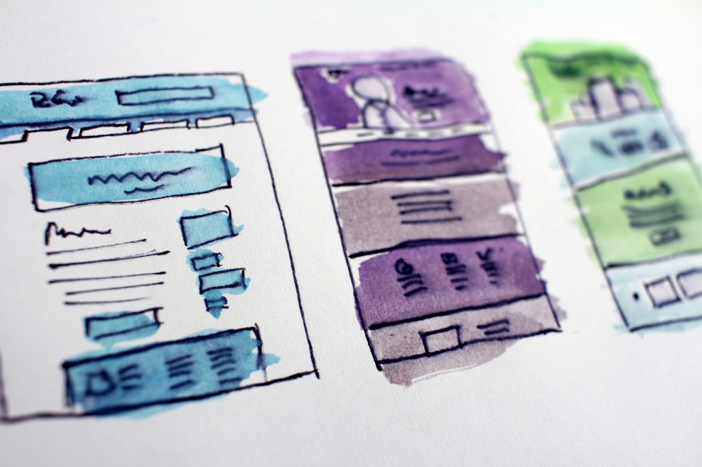
Website wireframe for an association — homepage example
Based on the listed examples I have worked out a wireframe that can act as a starting point, as some inspiration for your project. Do you want to add more content on your homepage or do you want fewer content, it is up to you of course to decide.

Website Design for an Association
This article was posted by Jonas Bogaert on 14/10/2019 in:
About Jonas Bogaert
I'm a sports enthusiast with a special interest in fan experience, digital marketing, data and design. Follow me on Twitter @JonasBogaert.
Contact me